Introduction
Select fields can be used to enable the form filler to make a choice either as a select one or a select many - based on a fully configurable list. The lists can be provided as list format (drop downs) or using radio buttons or checkboxes as required.
When creating a list we would recommend keeping the values succinct - rather than copying the labels as values cannot include non alphanumeric characters
Adding a Select Field
To add a list field use the list icon on the form designer screen.
This will give you the facility to go back and 3 field options.
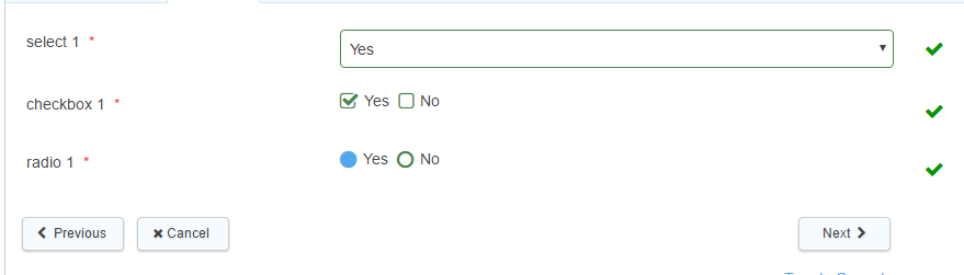
- Select Field enables the form filler to chose an answer via a drop down list
- Checkbox enables the form filler to select an answer (or multiple answers) using checkboxes.
- Radio enables the form filler to select a single answer using radio buttons
Basic Field Properties
All of the basic field properties apply to these fields except 'Hidden'. A select field can be hidden by selecting the checkbox in the Advanced tab.
When using select fields, the values inside them have a 'label' and a 'value', in the same way normal text fields do in the Forms Designer. The 'label' is the text the user sees, while the 'value' is the same as the 'dataname' of a field - a unique identifier for the option. If you use a select field called 'selectfield' and then a text field beneath it which has a default value of {selectfield} it will pull the value of the option selected by the user. If you want it to show the label of the option, you can use {selectfield:label}.
When using select fields it is possible to pull through either the label or the value of the selected item (Note: only works when using Integrations V2)
- For email/printable integrations, the value can be shown by using {dataName:value}. For all other integrations, the value can be shown by using {dataName}.
- The label can be shown by using {dataName:display}
For other field types it would be necessary to use a hidden field to capture the field labels where required
(It is not possible to pull the labels from fields in a subform, again this would need to be achieved using hidden fields on the parent form).
Note: special characters such as commas cannot be used in the value of any field options
Setting a select field to 'allow multiple' will allow you to remove all options and leave the field blank. This also applies to checkbox fields. On the other hand, once an option has been selected in a 'select one' style radio or select field, the option cannot be deselected leaving the field blank - as a choice must be made.
Standard
List Source allows the choice of either an existing list through a lookup, or create new list by selecting 'One Time List' and inputting your values into the Label entry box, or through a token (where content is defined elsewhere - this can only be used within the Firmstep Apps eg Contact Us and Report It).
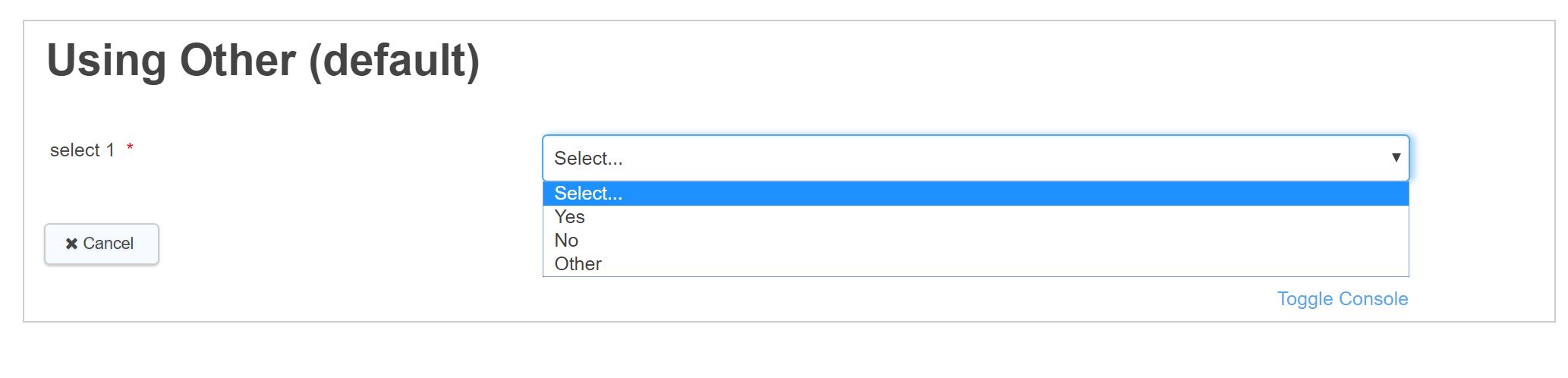
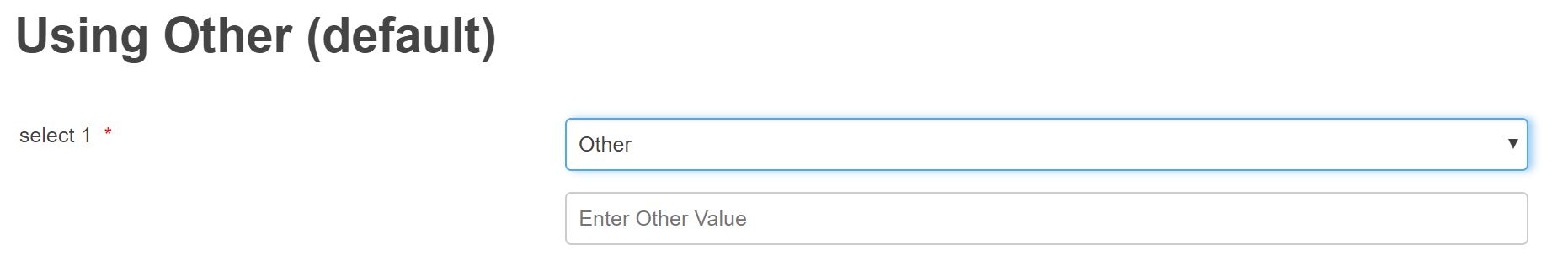
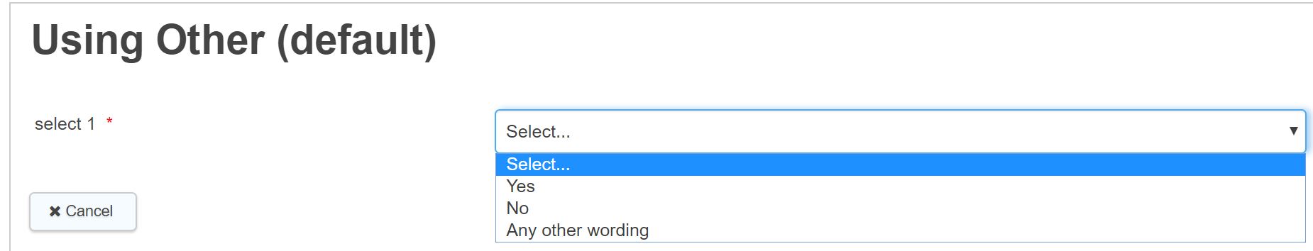
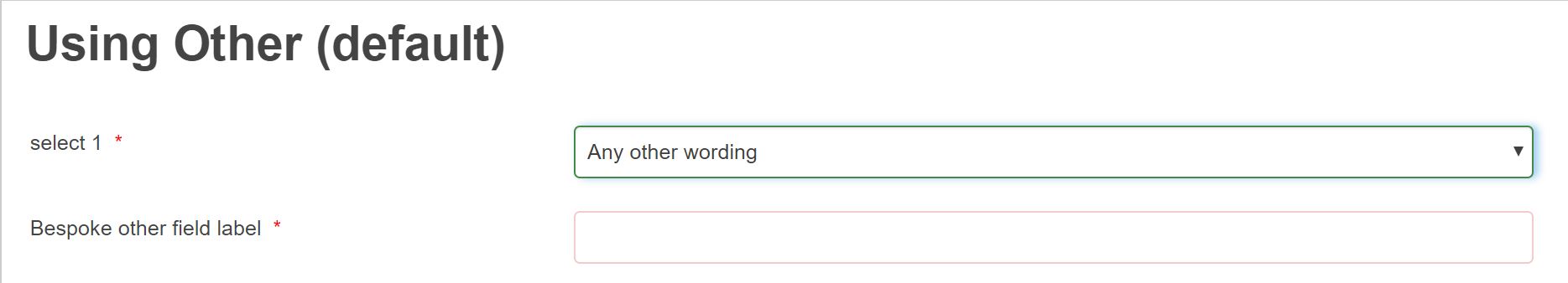
Allow Other - allows a standard default "other" option to be selected when ticked - but note the label cannot be changed and the field cannot be used to control other input in terms of display or validation conditions. An alternative more flexible option is to add your own "Other option" directly to the select list and then configure an additional field to be displayed when "other" has been chosen from the list. Examples below:
a) Allow other default option
b) Default Other input field
c) Allow other - customised list option - the other option can be named as required
d) Allow "other" customised field - shows flexibility of label option to give greater degree of instruction to form filler
Lookup will appear if a lookup is chosen as the list source. An appropriate lookup can then be selected for that list; for more information on building lookups, please see the integration section of this help.
Validation
- Mandatory is the default setting for a field. Making a field mandatory requires the Form Filler to enter a value. If a field is mandatory the mandatory icon* is shown. Unticking the box removes it from being mandatory.
- Mandatory Message is what will display if a field is mandatory and left empty.
- Minimum Choices is where you can enter the minimum choices a form filler has to make.
- Maximum Choices is where you can enter the maximum choices a form filler has to make.
- Minimum Choices Message & Maximum Choices Message will be displayed if either the minimum Choices or maximum maximum choices criteria hasn't been fullfilled.
Advanced
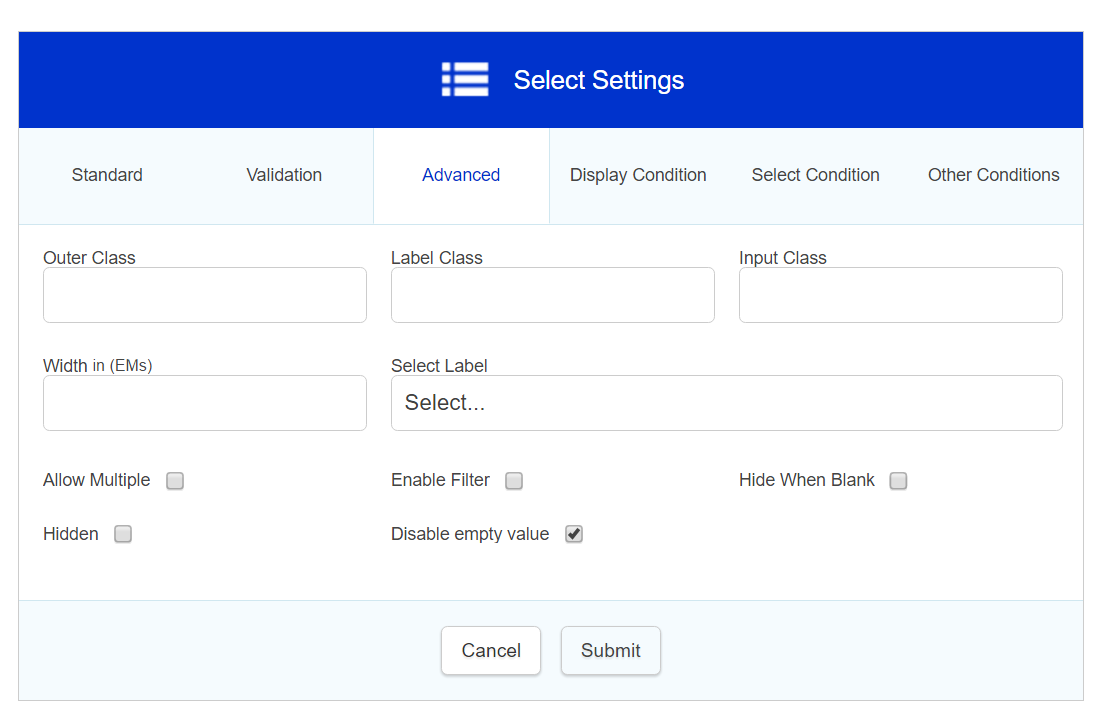
- Outer class is related to the CSS of the field in question. It is the class applied to the outside of the whole field (usually a div that wraps around the filled label and the input box). This is useful if a form designer wishes to highlight a whole field, perhaps by changing the background colour and making it larger. A specific class name can be added in here that will override the default one.
- Label class - This allows a specific class name to be added to the field label (the text part of the field)
- Input class - This allows a specific class name to be added to the input area (the bit the form filler fills in)
- Width (EMs) - An integer value (i.e. 1, 2, 3 etc.) can be placed in here to set the specific width of a field.
- Select Label will appear on the select field only, this allows the form designer to change the default "select" message in the dropdown.
- Allow Multiples when selected allows multiple selections rather than just 1. (Allow Multiples is only available on select fields, Radio will always be Select One and Checkbox is always Select Many)
- Enable Filter turns on / off the search box on the top of a select field list. If a large select list is being presented to the form filler, this us a useful feature to have enabled as it allows the filler to type what they are requiring in the list, and for the list to filter the results down, achieving an autocomplete facility. Especially useful for long lists eg counties.countries
- Hide When Blank - Hide when blank hides a field on second stages and beyond when the field doesn't have a value in the first stage
- Hidden - field will be hidden from form filler
- Disable empty value - The default status of select is not shown, if a default value is defined this will be shown if there is no default value then the first item in the list will display
Display Condition
Field display conditions allow fields to be displayed only if certain criteria have been met on a previous section. The field in question will only be displayed if the condition is met.
Note: Any field hidden via display condition is always considered Null regardless of default value, so if requiring the hidden field to trigger an integration then will need to run the integration when the hidden field isn't the default value.
Select Condition
We recommend you do not use select conditions - display conditions should be used instead
Other Conditions
Mandatory Condition - allows a field to be made mandatory based on a defined condition (within current section)
Readonly Condition - allows a field to be made read only based on a defined condition
Further useful reading:
top of page
