Introduction
Number fields can be used to restrict the input of a field to a numeric only and are useful when setting up payment forms.
Using Number Fields
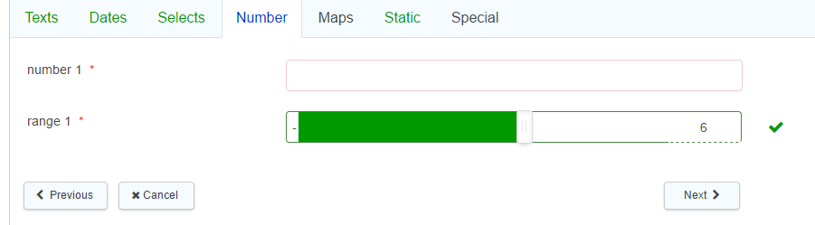
To add a number field use the number icon on the form designer screen this will give you the facility to go back and 2 field options:
- Number fields only allow number inputs. It cannot recognise zero's as the first number, if the field requires a leading zero, use a text field instead with a numerical only validation mask.
- Range fields allow for number inputs between a range of two numbers, for example between 1-10. The number is displayed in a box with a slider so you can adjust the input within the range.
- Please note that when a value is typed into a number field when completing a form that is set as the Range field type, it does not update formulas in other fields that contain a token to that number field, even though it does visually change the slider. This behaviour only occurs when the value is typed, formulas in other fields are updated correctly when the slider is moved with the mouse. As you cannot predict how the citizen will complete the form, we would advise not using range fields, if later referenced in calculations, and that a number field be used instead.
- Range fields do not respond as expected to 'read-only' status, and can still be amended despite being marked read-only. As such, we advise that if read-only is required, a number field be used instead.
All of the basic field properties apply to these fields.
Standard
There are no additional field properties of the basic properties for these field types.
Validation
Minimum Value & Maximum Value are validation conditions for the number in the field value. If the field doesn't match either criteria it will display the appropriate message.
Advanced
- Outer class is related to the CSS of the field in question. It is the class applied to the outside of the whole field (usually a div that wraps around the filled label and the input box). This is useful if a form designer wishes to highlight a whole field, perhaps by changing the background colour and making it larger. A specific class name can be added in here that will override the default one.
- Label class - This allows a specific class name to be added to the field label (the text part of the field)
- Input class - This allows a specific class name to be added to the input area (the bit the form filler fills in)
- Prefix & Suffix allow for the placement of numbers, letters or character prior and after the date entry. For example the Prefix was £ and the suffix .00 and the data entered 5 the field value would be £5.00.
- Number to text displays the number input by the form filler as text (in English) to the right of the field
- Decimal Places allows the form designer to specify a maximum number of decimal places on a field (any input past this number will be automatically rounded off).
Display Condition
Field display conditions allow fields to be displayed only if certain criteria have been met on a previous section. The field in question will only be displayed if the condition is met.
Other Conditions
Mandatory Condition - allows a field to be made mandatory based on a defined condition
Readonly Condition - allows a field to be made read only based on a defined condition
Further useful reading:
top of page
