You can create your own view templates, which will be available in the View Template drop-down menu when setting up view page properties. The View Template Designer uses What You See Is What You Get (WYSIWYG) technology to enable you to easily create your own view page templates, controlling the layout, content, and design of your view pages.
1. Navigate to the Admin tab, then select the Templates sub-tab.
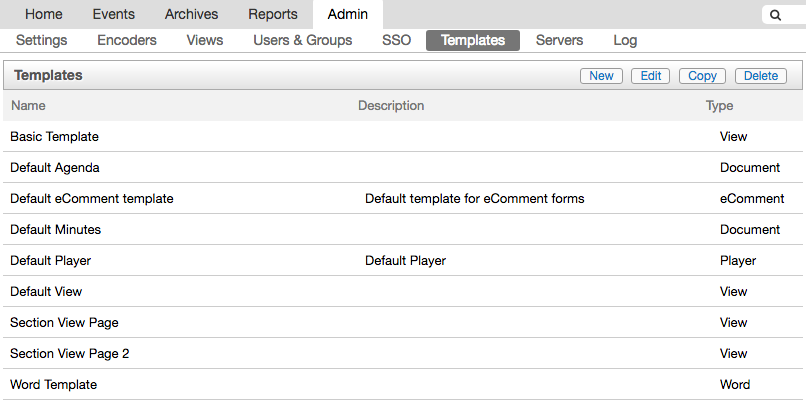
2. Any existing templates display in the list. Select a view template to edit it, or create a new template from scratch. To build a new template, click New at the upper right. Otherwise, select Edit after selecting an existing view template.
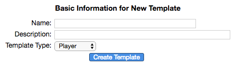
3. Type a name in the Name field, and a description if you'd like. Using the Template Type drop-down menu, select View. Click Create Template.
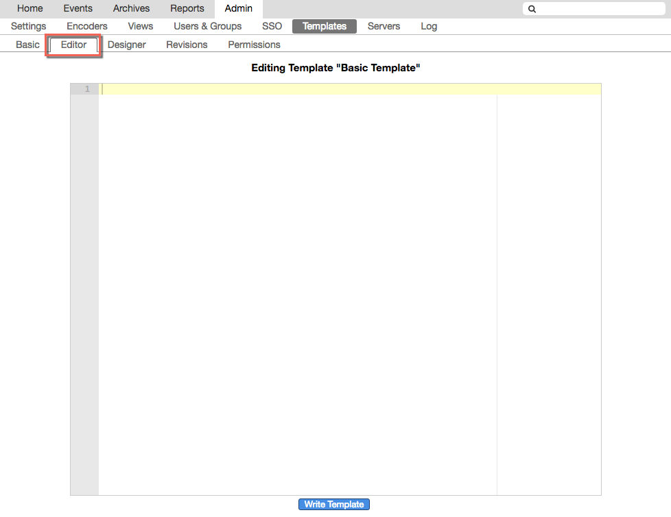
4. If you're editing an existing view template, click the Editor tab in the third-level menu to ensure that the Editing Template field is empty. The presence of HTML content in the field will disable the designer.
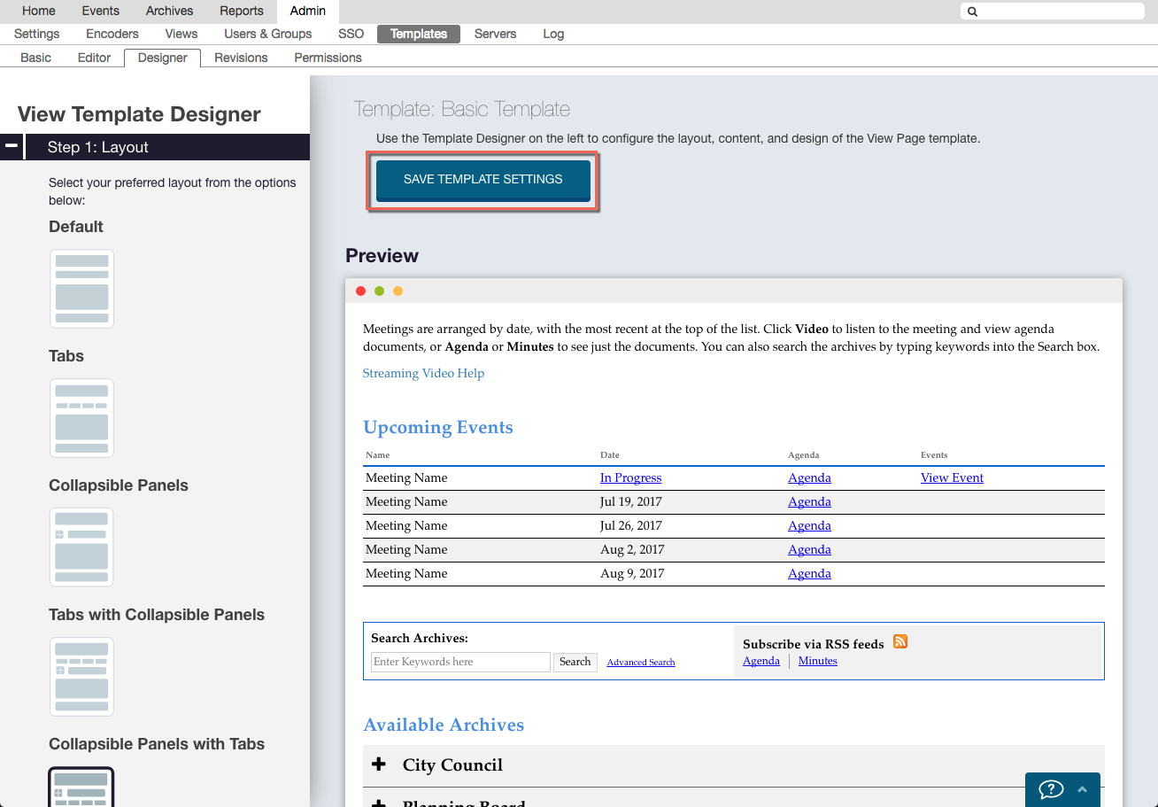
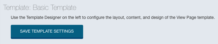
5. Click the Designer tab. The View Template Designer loads with the default layout and design. Make changes in the Layout, Content, and Design sections (see below), then scroll back to the top of the preview pane and click Save Template Settings. Your changes will not be applied until you click this button, and if you navigate away from the page before saving, all changes will be lost.
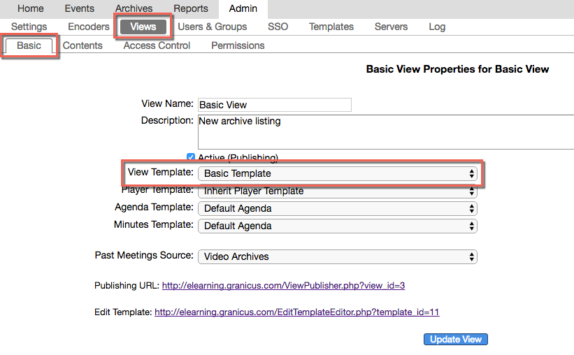
6. To see your settings on a page, assign your template to a view. In Basic View Properties, select the template you just created in the designer from the View Template drop-down menu. Click Update View, then select the Publishing URL to be taken to the view. To make additional changes, click the Edit Template link and then click the Designer tab again.
Sections of the View Template Designer
Step 1: Layout
1. The Layout section enables you to select one of five layout options. The right side of the page displays a preview of the selected choice. Select Default, Tabs, Collapsible Panels, Tabs with Collapsible Panels, and Collapsible Panels with Tabs. Click each one to see changes to your content layout reflected on the right side of the page.
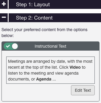
Step 2: Content
1. Click the Content header to see the content options. The first is the Instructional Text editor. This enables you to change or hide the text that displays at the top of the view page above the meetings. Use the toggle switch to display or hide the text. Click the Edit Text button to change the text from the default.
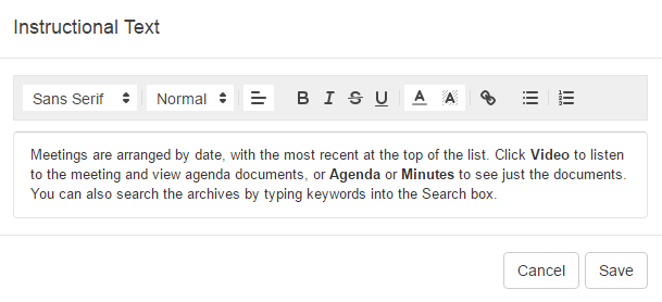
1a. The Instructional Text editor displays as below. You can use the toolbar at the top to customize the text's format, style, and color, and you can click in the text field to change the text itself. When you're done editing, click Save.
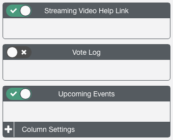
2. The Streaming Video Help Link toggle enables you to display or hide the public help pages that Granicus provides for your constituents and site visitors. If enabled, a link will display at the top of your view page just under the instructional text.
3. Click the Vote Log toggle to include your vote log on the view page.
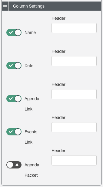
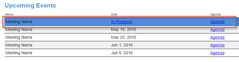
4. The Upcoming Events toggle lets you include upcoming events on your page or hide them. Click Column Settings to control which columns will display.
4a. Turn off the toggle switch next to any column you do not wish to include. The Header fields enable you to change the names of columns; click within any of these fields to edit the name. As you make changes throughout this process, the preview pane on the right updates.
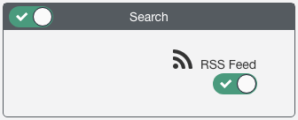
5. The Search section enables you to control whether to include a Search field and the RSS feed. Note that you must have the Search field enabled in order for the RSS Feed to display.
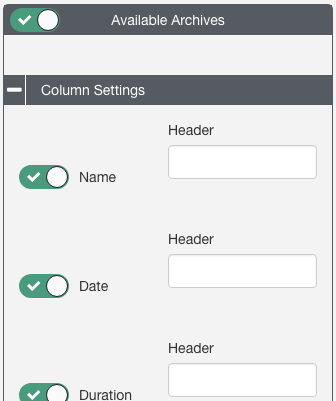
4. Available Archives works the same way as the Upcoming Events section. Use the toggle to disable available archives if you do not want them to display on the view page, and click Column Settings to hide columns or edit column headers.
Step 3: Design
This section is where you control font styles, formatting, and colors for your view page.
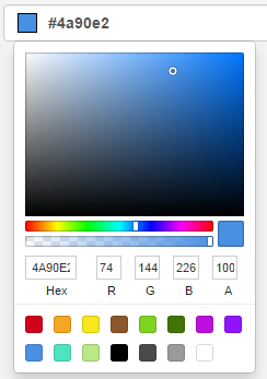
1. Use the color pickers in any of the color fields to select a new color for each element you'd like to change. You can use the color bar, or enter a custom color using hex codes or RGB values. To exit the color picker, click out of the box. The preview pane on the right will display your choices.
To preview hover colors, hover over the element in the preview pane:
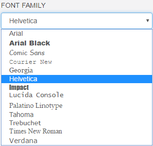
2. The Font Family drop-down menu gives you a variety of common, web-safe choices. Choosing a font from the menu will apply it to all of the text on the page, including headers and links.
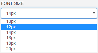
3. The Font Size menu enables you to choose a font size from 10 to 20 pixels.
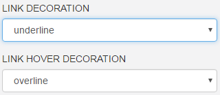
4. You can also apply a link decoration and link hover decoration using the respective drop-down menus.
Remember to scroll to the top of the preview pane and click Save Template Settings after making any changes.
For more about view pages, see Creating and Editing a View Page.
