Contents
To avoid manually editing the code for each template, govDelivery offers Flexible Templates, a drag-and-drop editor for creating simple, responsive templates for bulletins to ensure the most responsive and consistent content across devices and email clients.
Disclaimers
- Email clients (such as Gmail, Outlook, and Apple Mail) apply different rules for displaying content and interpreting code. As a result, an email that displays correctly in one client may display differently in another. If a majority of the subscribers use the same client, format the bulletins accordingly.
- Media queries are a core component of responsive emails. These CSS rules detect the device or screen size used to view the email and apply formatting accordingly. However, not all email clients support media queries, so even well‑configured HTML may not render correctly in some clients. Review which email clients support and do not support media queries before troubleshooting any issues.
Best Practices
- Keep the bulletin content short, simple, and concise.
- Use the Landing Page feature to provide additional information.
- Avoid using a table of contents with anchor tags, as they do not work in some email clients.
- Keep the total email width to 600px (pixels) (the default if using Flexible Templates) or fewer to display nicely on most devices.
- Use a font size of 14-16px for body text, and 20-26px for headers.
- Use sensible alt tags in images for subscribers who have images turned off or are using screen reading software.
- Keep subject lines under 60 characters, as long subject lines are truncated on smaller screens. Some phones only display the first 35 characters.
- Use preheader text to entice readers to open the bulletin. This text is typically pulled from the first few lines at the top of the email and is meant to build on the subject line. If you use the Advanced Bulletin Editor, there is a separate field for entering your preheader text (see Constructing Your Advanced Bulletin). Often the first line of an email contains the VIEW_THIS macro, so be sure to place the preheader text before the banner, macros, or any other content.
- Images uploaded should not be larger than twice as wide as the final width of the image.
- Send a test bulletin and open it on a mobile phone to see how it displays.
- Use a tool such as Litmus to preview the bulletin in multiple email clients at once, including mobile clients.
Images
To avoid images compressing and appearing blurry, ensure that they are no more than twice as wide as the final width for that image. The default width of a bulletin created with flexible templates is 600px, minus padding, which is 15px on the left and right. This gives 570px of content area to work with. For best results, any banner images should be no wider than 1,140px and .png format, as it gives a sharper result than .jpg or .gif formats.
When you send a bulletin, govDelivery uses a script to resize images that are too large, which can result in fuzzy or pixelated images. To avoid this, use properly sized images:
Recommended Image Sizes
Banner
Display size: 600 px wide
Upload size: 1100 px wide
Full-width body image
Display size: 570 px wide (with 15 px padding)
Upload size: 1100 px wide
Two-column image
Display size: 270 px wide
Upload size: 500 px wide
Three-column image
Display size: 170 px wide
Upload size: 325 px wide
Also applies to left and right sidebars.
Thumbnail image
Display size: 182 px wide
Upload size: 350 px wide
Social icons in the template
Display size: 36 px high
Upload size: 60 px high
Images and Text
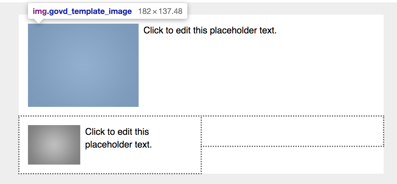
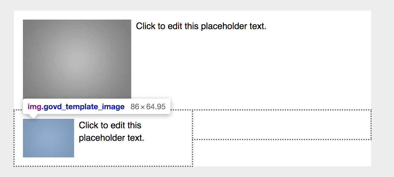
For Image+Text content block, the image size is determined by the type of section in which it is placed. For best results, check the available space for the image before uploading:
- Right-click on the image placeholder.
- Click Inspect Element (or Inspect, if using a Mac).
- Hover the mouse over the image placeholder to view its size.
Example
The image placeholder for an Image+Text block placed in a one-column section is 182 x 137 pixels, while the same content block placed in a two-column section yields a placeholder that is only 86 x 65 pixels.
Further steps to optimize the bulletin for mobile users:
- Click the Text Wrap button
 to set the text to wrap around the image.
 - Right-align the image, so all text is left-aligned, and the bulletin's text flows predictably. When readers scan from top to bottom, they do not need to jump around to find headings or read the text.
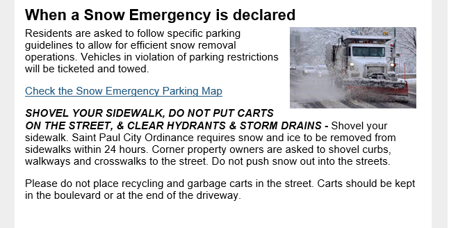
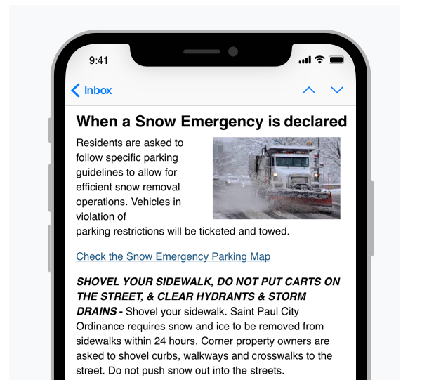
- Split any headings into their own text block and set them above the image text block. This makes headings much easier to read and scan, especially on a small screen.
Example
| Description | Desktop | Mobile |
|---|
|
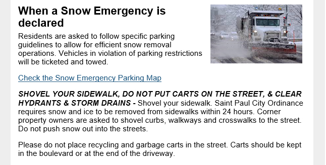
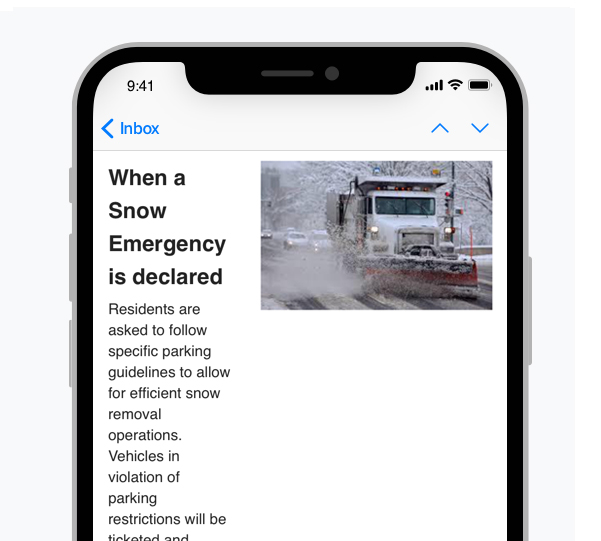
Image + text block is not set to text wrap
Result: Creates unwanted white space and inconsistent layout, as email clients render content differently across devices.
|  |  |
|
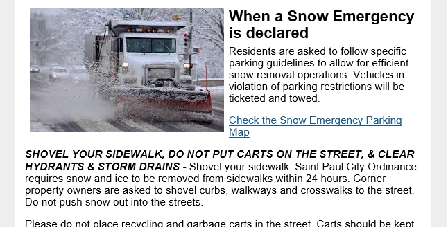
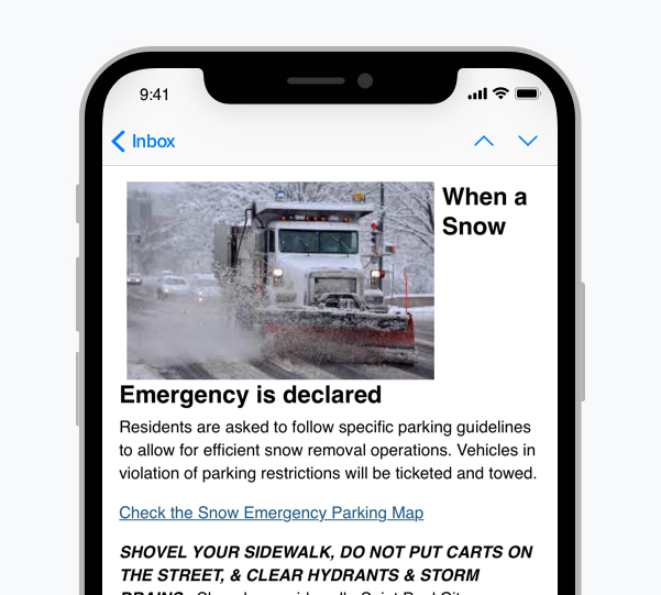
Text wrap is enabled, but the image is too large
Result: Causes text to display compressed in some clients or shifts all text below the image.
|  |  |
|
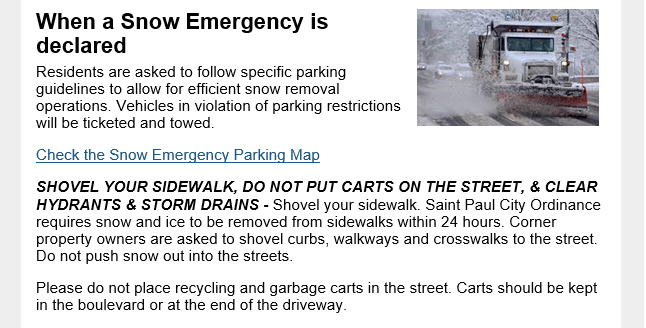
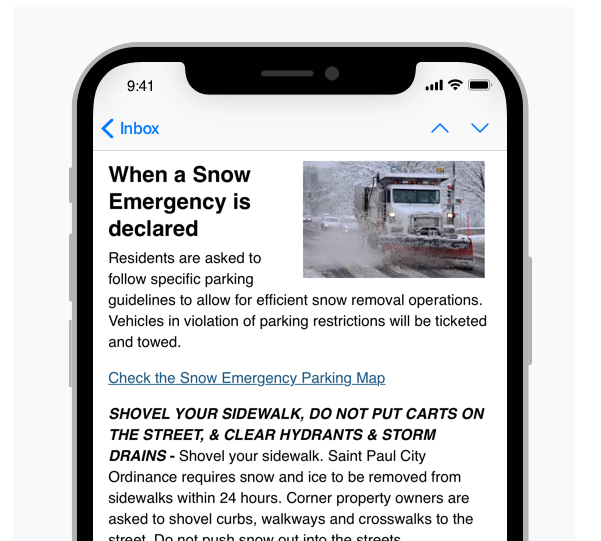
Text wrap is enabled, but the heading is included in the inline text block
Result: Reduces heading readability and makes the content harder to scan.
|  |  |
Best result: Text wrap is enabled, and the heading displays in a separate text block above the image + text block.
|  |  |
Section Dividers
The default section divider for flexible templates is a thin horizontal line that automatically scales to fit the size of the screen on which the bulletin is viewed. To customize section dividers, add the image in the Themes tab; the same considerations for other images apply: images no wider than 570px (or less, if extra padding is added to the sides).
Outlook
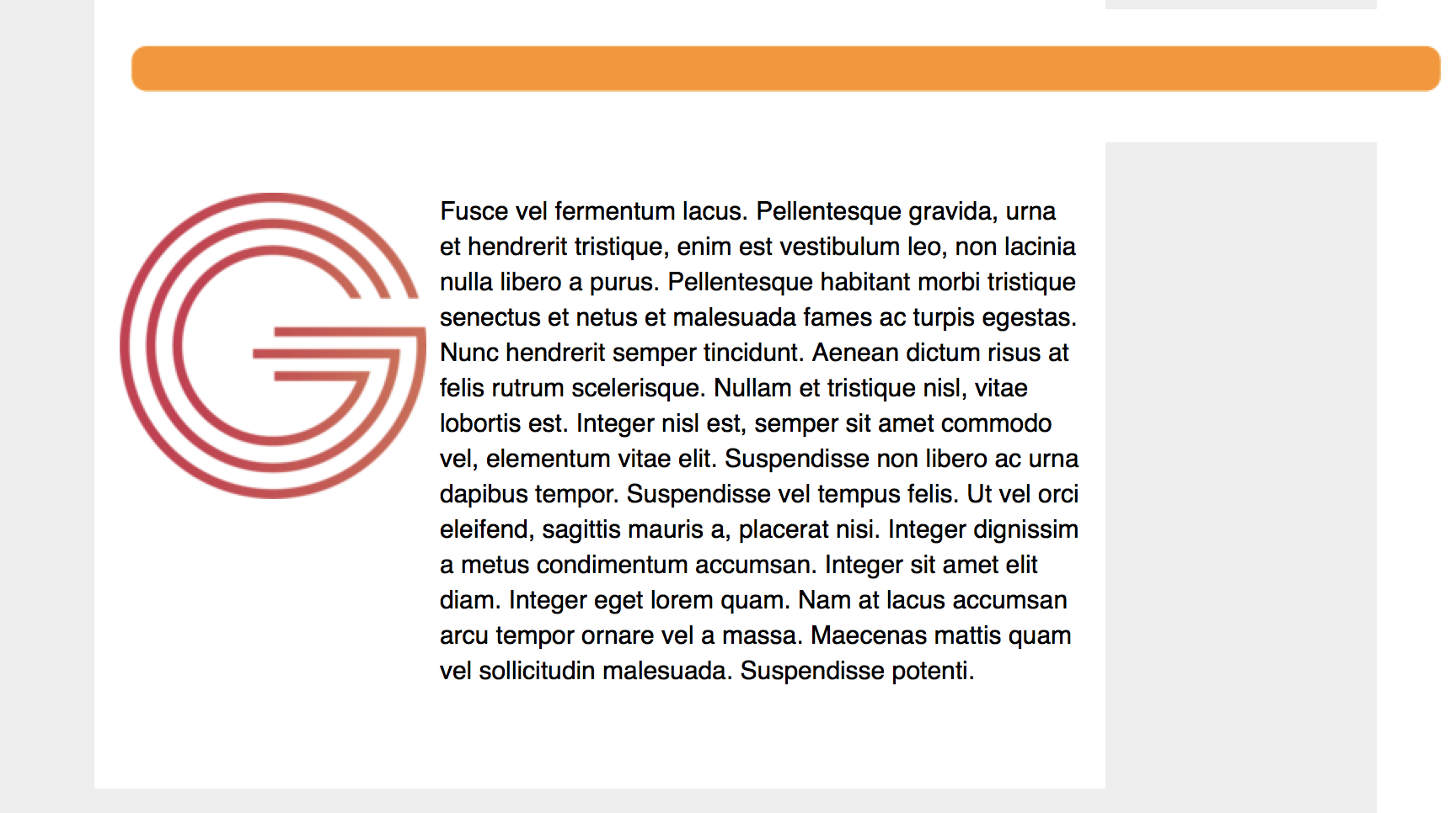
Gmail
Footer
Recommendations:
- Keep the footer simple.
- Use a single column design, with centered content that does not exceed the width of the bulletin content area.
- Include only the information needed, like contact information, unsubscribe links, and any legal disclaimers if necessary.