The Component Builder provides users the ability to create custom Components for their CMS. A new Development dropdown menu will appear in the toolbar(?). Hovering over the Development menu displays the Component Builder.
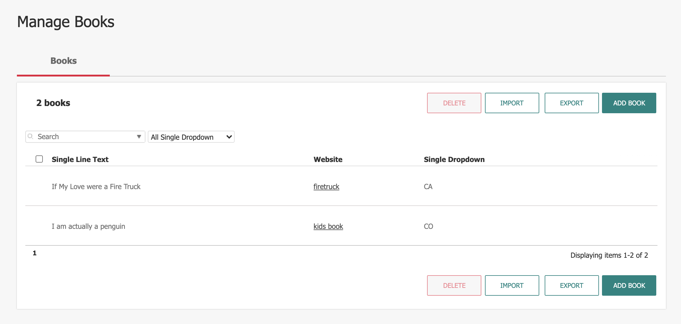
Component List View
This page displays all of the Custom Components that have been created for the CMS.
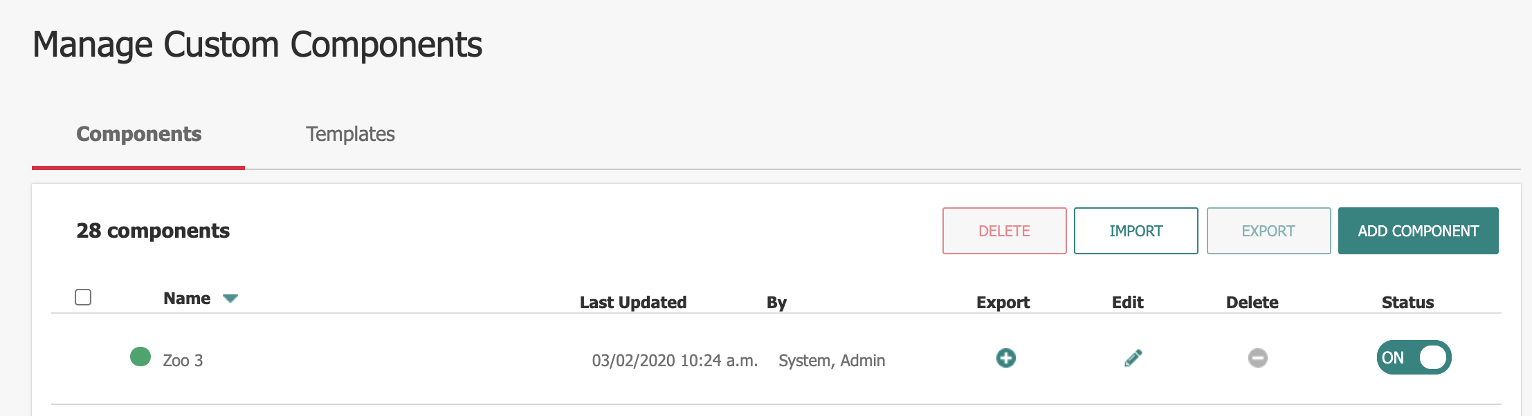
- Name: Component Name
- Last Updated: Date/Time the Component was last edited.
- By: Last user to update the Component.
- Edit: Edit the Component
- Delete: Removes the Component (must not be in use), or selected Components.
- Status: Toggle the Component On/Off
- Add Component: User taken to Add view for setting up a new Component.
Add a New Custom Component
Click Add Component to begin the process for adding a new Component. The CMS guides the User through a 3-Step process for setting up a new Component.
Step 1: Create a Component
Section A: Summary
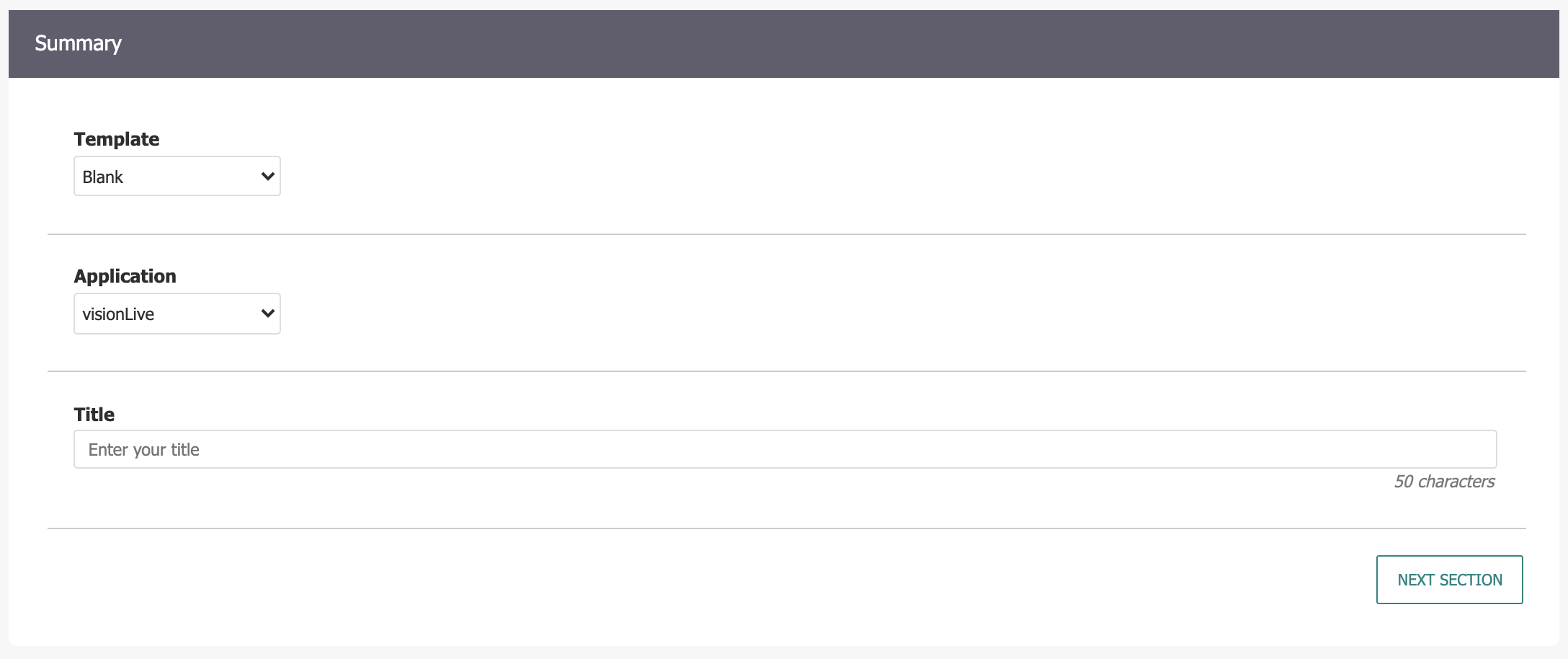
- Template: User can select a pre-existing Component Template for quicker set up of a new Component. Creating Component for the first time? Use a "Blank" Template.
- Application: Select if the Component will be used for visionLive (standard CMS) or visionPulse (community engagement). Components will primarily be utilized for visionLive.
- Title: Give a descriptive Title for the Component
Section B: Index List Details
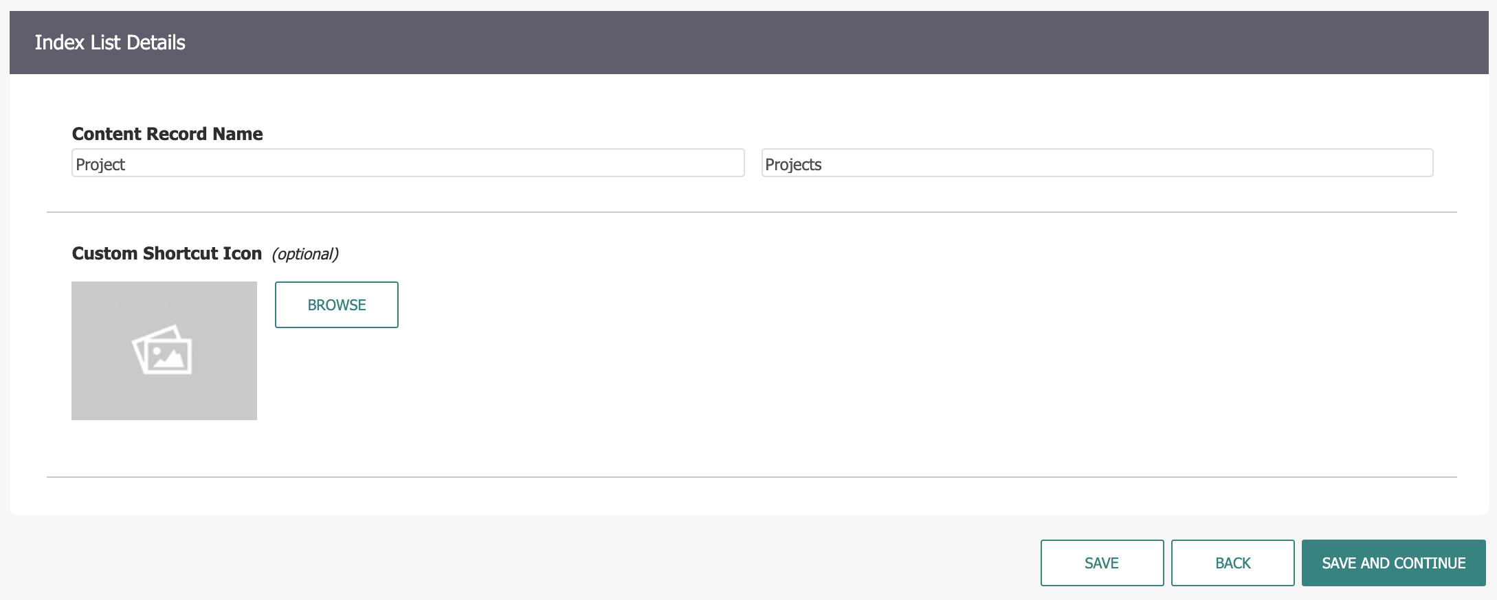
- Content Record Name (Singular): Provide a name for the Content Record Type.
- Content Record Name (Plural): Provide a name for multiple Content Records.
- Custom Shortcut Icon: Browse Image Library and select an icon for the Dashboard Shortcut.
- Save and Continue to Step 2.
Step 2: CMS User Display
The information captured and/or displayed by your custom Component is configured during this step. This is similar to the Edit Form Design view that the Form Builder utilizes. Fields can quickly be added, removed, and re-ordered by simply dragging and dropping the fields or using the +/- buttons.
Add a Field
Add the following types of component fields to the custom Component:
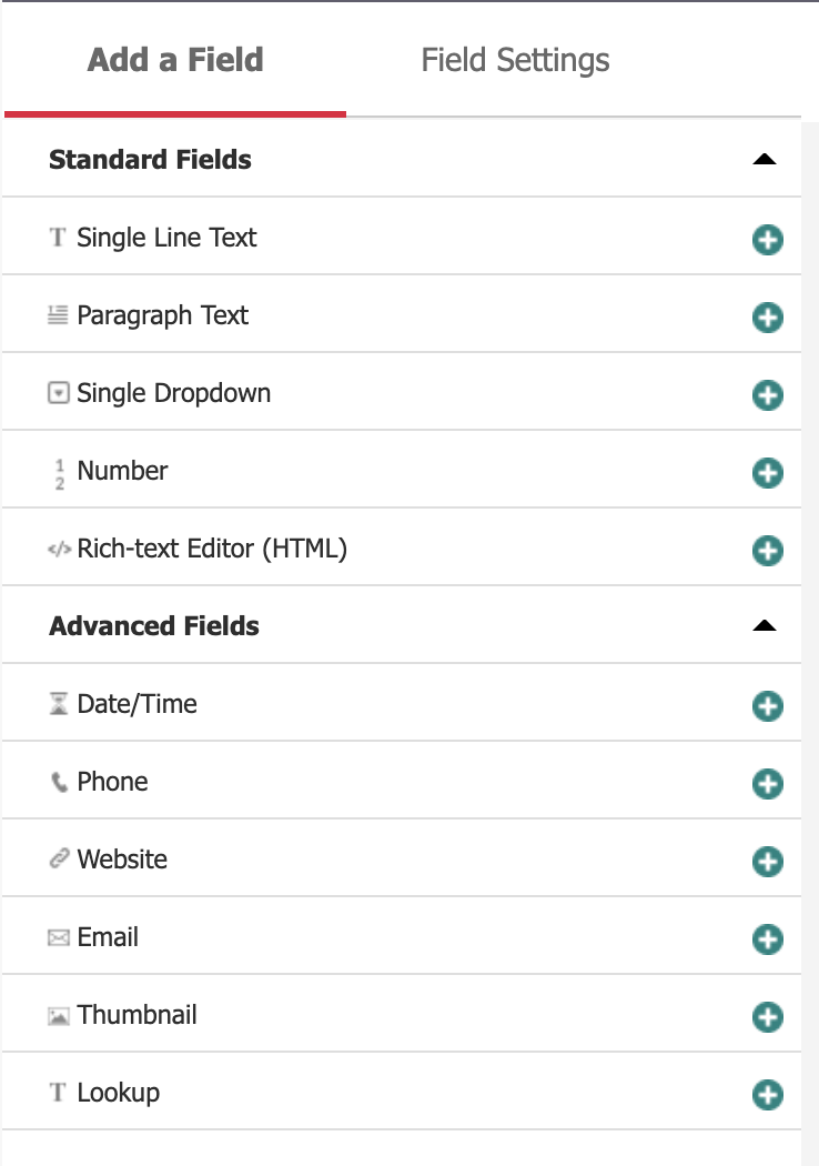
- Single Line Text: Short text entry. 70 character max.
- Paragraph Text: Long-form text entry. 500 character max.
- Single Dropdown: multiple options with a single selection.
- Number: Text field that only accepts numeric values.
- Rich Text Editor <HTML>: RAD Editor for additional content.
- Date/Time: Select a Date/Time value from a Calendar and Time picker.
- Phone: Text field that accepts phone number value.
- Website: Text field that accepts a valid URL value.
- Email: Text field that accepts a valid email value.
- Thumbnail: Select an image from Image Library.
- Lookup: Choose a record stored in another Custom Component.
Field Settings
Each Component field can be configured by clicking on it, and then switching over to the Field Settings tab. Generally, each Field will have the following options (there may be additional options based on the field type):
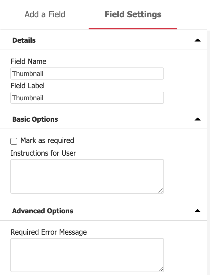
- Field Label: Label that will appear in component/front-end view for this field.
- Mark as required: Requires a value to be provided.
- Check for duplicates: Requires each record to be unique if checked.
- Allow search: Can be searched by CMS Users in Component List View.
- Instructions for User: Provides instruction for CMS Users adding new items to the Component.
- Pre-populated Value: Value is already filled when creating a new item.
- Required Error Message: Overwrites default error message that appears if field is left blank.
Step 3: List View
Determine visible fields for both the Component List View for CMS Users as well as the Default List Widget for the Custom Component. By default, the first field listed will be included in both the Index and Default List Widget.
Index View
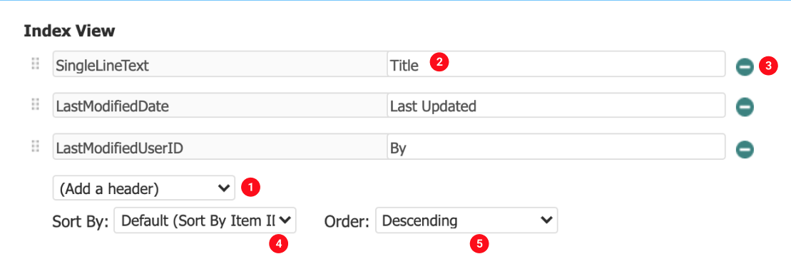
- Add a header: Select a field from the dropdown to display it as a header in the Index View.
- Heading Title: Edit this field to change the heading display text.
- Delete button: removes a heading.
- Sort by: By default sorts by Item ID, but can also sort by a given heading value.
- Order: Choose Descending or Ascending.
The Default List Widget setup is identical to the Index View setup, the only difference being that LastModifiedDate and LastModifiedUserID are not available as headings.
Step 4: Publish
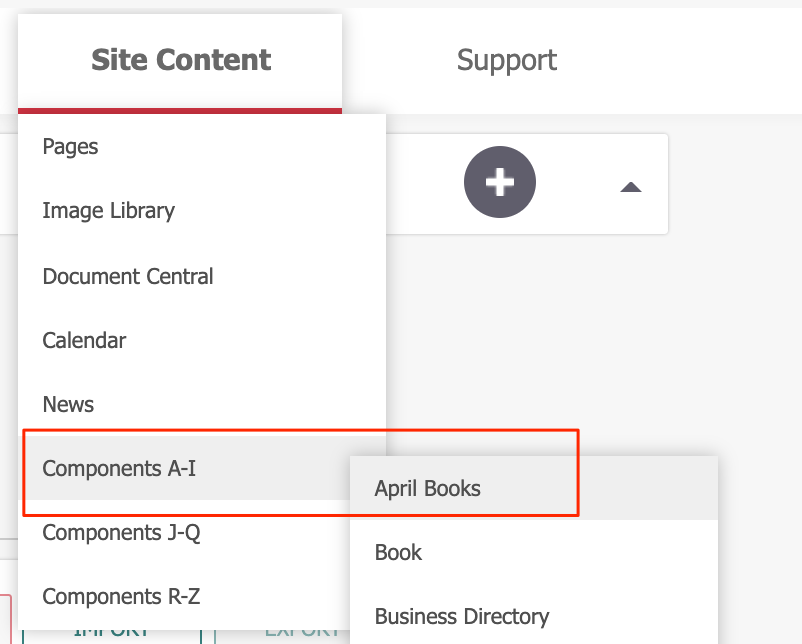
Publishing the new Component will create a default Component page along with a widget. (Note the System Variable: Default Advanced Component Page MUST be populated in order to establish a base page under which flexible component pages will create sub-pages.) You will be able to view the new widget in the Site Content drop-down menu:
Step 5: Security Role
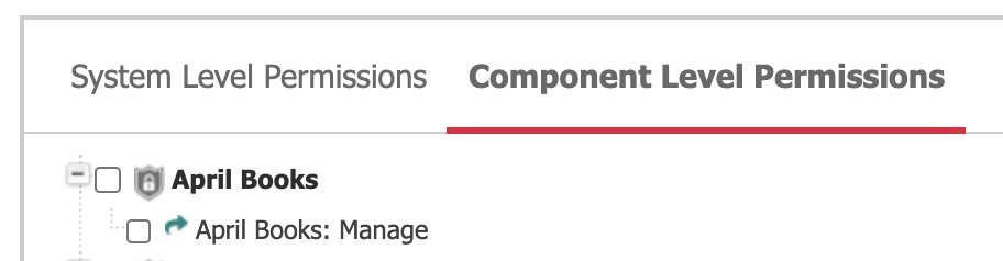
To provide regular CMS Users with access to the Custom Component, they will need to be granted the Security Role. The Security Role > Component Level Permissions tab will now display the Custom Component. Checking the box for "Manage" will allow CMS users to Add/Edit/Delete the Custom Component.
Step 6: Add Items
After the new component has been published, navigate to its location in the Site Content menu and click on the component. CMS users will see a screen similar to other CMS Components:
Adding the Custom Component to the Site
Add the Custom Component Widget to a Page Template
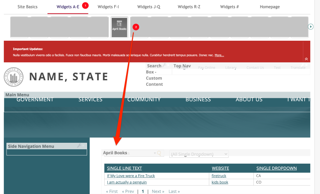
- Create or Edit an existing Page Template. The new Custom Component Widget will be located in its respective alphabetical tab.
- Drag and drop the widget into a Column.
Add the Custom Component Widget to a Page
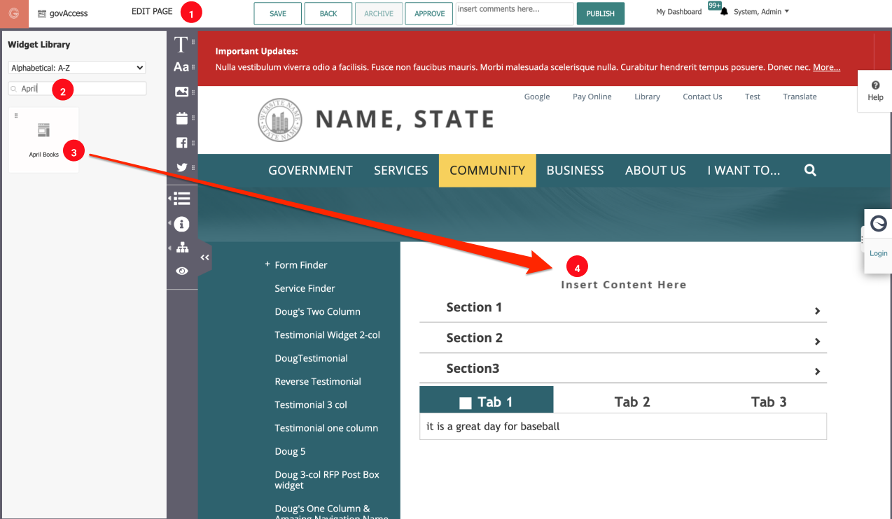
- Create or Edit an existing Page. Click on the Widget Library icon in the Control Panel.
- Search for or locate the Custom Component Widget.
- Drag the Custom Component Widget block from the Control Panel onto the Page.
- Drop the Custom Component Widget into the desired area on the Page.
(NOTE: This functionality is limited to Super Users or CMS Users with Templating Security Role)
