As more and more people view emails on their mobile phones, creating responsive email content is more important than ever. Many articles and blog posts on the subject encourage communicators to manually edit the HTML and CSS of their email templates to ensure the most responsive and consistent content across devices and email clients. To avoid this process of manually editing the code for each of your templates, govDelivery offers Flexible Templates, a drag-and-drop editor for creating simple, responsive templates for all of your bulletins.
First, a few disclaimers:
Every email client (such as Gmail, Outlook, Apple Mail, etc.) uses different rules for how they display certain content, and how they interpret certain code within emails. This means that an email which displays exactly as intended in one client, may look different in another client. If you know that the majority of your subscribers use the same client, we recommend formatting your bulletins with that in mind.
A core component of responsive emails is media queries, bits of CSS code that determine what kind of device or screen size is being used to display the email content, and which executes different code to change formatting depending on the device used to view the message. Some email clients do not support media queries, so even with perfectly-configured HTML, your email may not render correctly on this client. It's a good idea to familiarize yourself with which email clients support and do not support media queries before troubleshooting any issues.
General Advice and Best Practices
- Keep your bulletin content short, simple, and concise. Consider using the Landing Page feature if you need to provide additional information.
- Avoid using a table of contents with anchor tags, as they take up valuable space, and don't work in many email clients. If your bulletin is large enough to need a table of contents, consider shortening it, or using a Landing Page.
- Keep your total email width to 600px (pixels) (the default if using Flexible Templates) or fewer to allow your email to display nicely on most devices.
- We suggest a font size of 14-16px for body text, and 20-26px for headers, to allow subscribers to easily read your content.
- When adding links to images in your bulletin, use sensible alt tags for subscribers who have images turned off, or are using screen reading software. For example, instead of a button image with the file name "mobile_button_2.png", use an alt tag such as "Click here to read the full article".
- We suggest keeping subject lines under 60 characters, as subject lines that are too long will be truncated on smaller screens. Some phones will only display the first 35 characters, so it is best to keep subject lines as short as possible.
- Use preheader text – the snippet of text that you see in many email clients before opening the email – to entice readers to open your bulletin. This text is typically pulled from the first few lines from the top of your email and is meant to build on the subject line. If you use the Advanced Bulletin Editor, there is a separate field for entering your preheader text (see Constructing Your Advanced Bulletin). Often the first line of an email contains the VIEW_THIS macro, so be sure to place your preheader text before your banner, macros, or any other content.
- Any images uploaded should be no larger than twice as wide as the final width of the image. Refer to the attachment for more information about the ideal image size.
- ALWAYS send yourself a test bulletin, and open that bulletin on a mobile phone to see how it displays.
- Use a tool such as Litmus to preview your bulletin in multiple email clients at once, including mobile clients.
Images
In general, .png images will give you a sharper result than .jpg or .gif images. To avoid images compressing and appearing blurry, ensure that any images you upload for use in a bulletin are no more than twice as wide as the final width for that image. The default width of a bulletin created with flexible templates is 600px, minus padding, which is 15px on the left and right. This gives you 570px of content area to work with. Thus, for best results any banner images you upload should be no wider than 1,140px wide. Refer to the attachment for more information about the ideal image size.
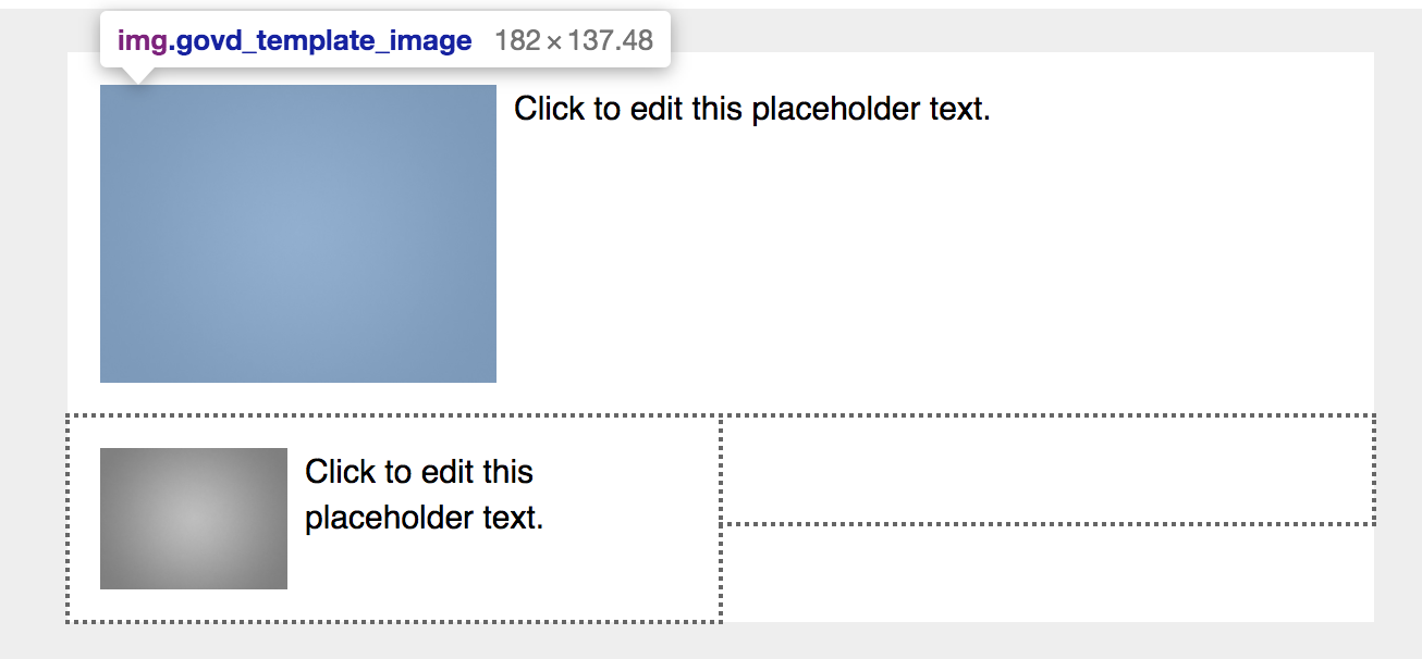
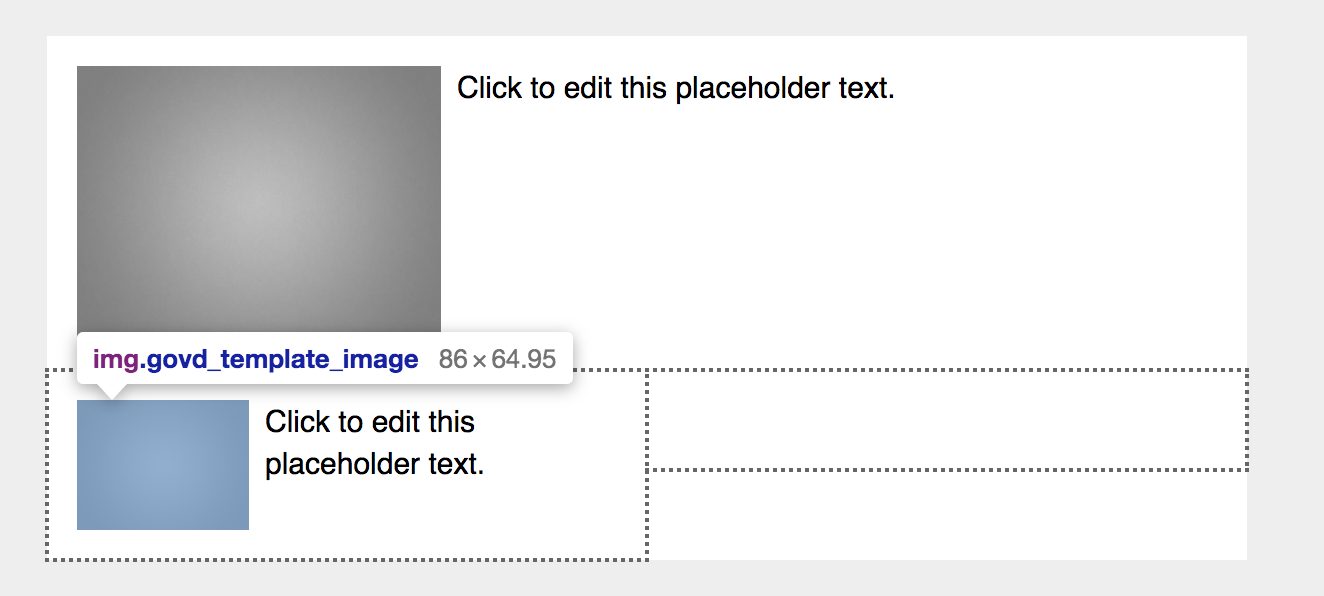
The available space for images that do not span the entire width of the bulletin can be trickier. If using an Image+Text content block, the image size will also be determined by the type of section in which it is placed. For best results, check the available space for your image before uploading: right click on the image placeholder and click Inspect Element (or Inspect, if using a Mac), then hover your mouse over the image placeholder to view its size. In the examples below, the image placeholder for an Image+Text block placed in a one-column section is 182 x 137 pixels, while the same content block placed in a two-column section yields a placeholder that is only 86 x 65 pixels.
Images and Text
Once you determine the correct size for your images, there are some further steps to optimize your bulletin for mobile users, especially when using the Image+text blocks:
- Always click the Text Wrap button
 to set the text to wrap around the image.
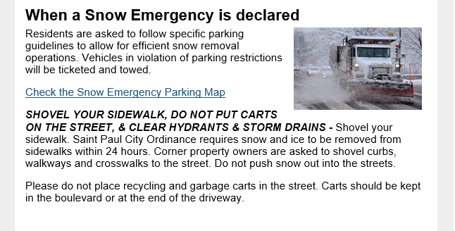
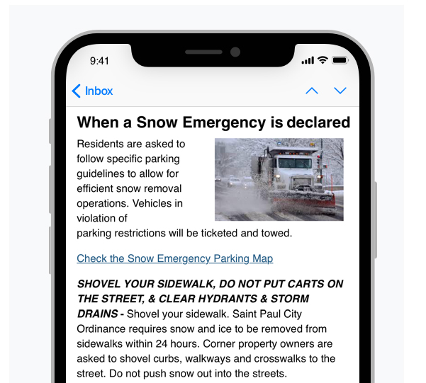
 - Right-align your image, so all text is left-aligned, and your bulletin's text flows in a predictable manner. When readers scan from top to bottom, they don't need to jump around to find headings or read your text.
- Split any headings into their own text block, and set it above the image text block. This makes headings much easier to read and scan, especially on a small screen.
Below are some good and bad examples of these tips in action:
| Description | Desktop | Mobile |
|---|
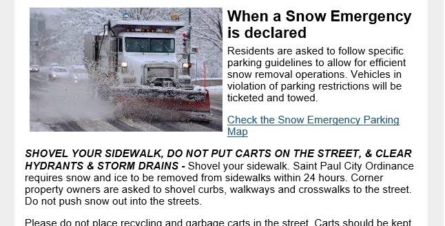
| Image+text block not set to text wrap. This results in unwanted white space and often unexpected outcomes, as not all mobile email clients will handle this the same way. |  | 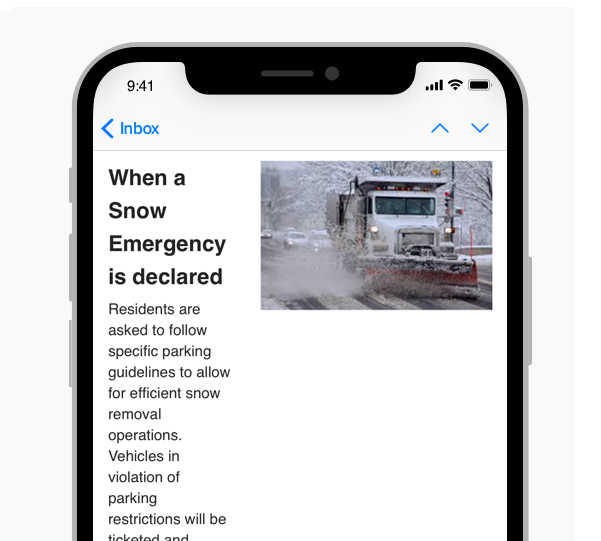 |
Text wrapping is on, but the image is too large. This yields inconsistent results: text may be squished in some clients, or all text may be pushed below the image.
|  | 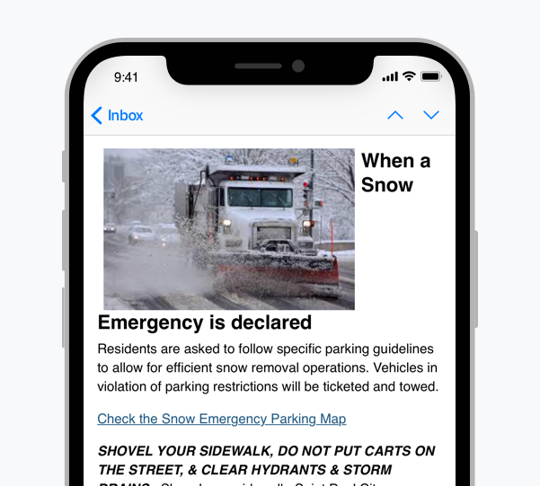 |
| Text wrapping is on, but the story heading is included in inline text block, which may cause the heading to be harder to read. This is not the worst outcome, but the presentation could be better. | 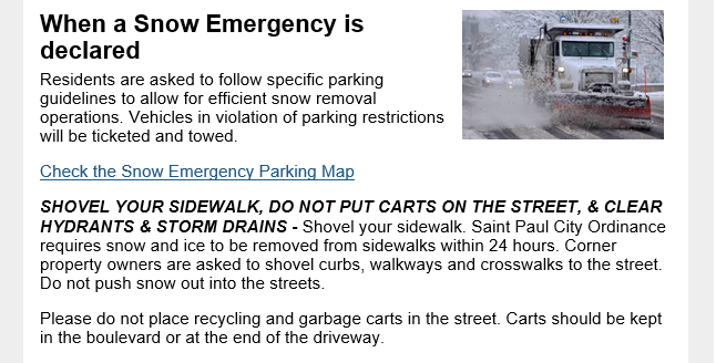 | 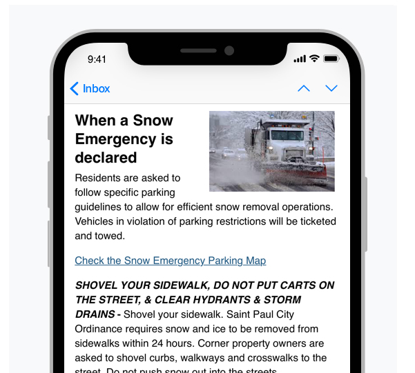 |
Best result: Text is wrapping, the heading is split into its own text block and set above the image+text block. This results in a heading that is very easy to read, an image that is easy to recognize, and story text that is easy to read.
|  |  |
Section Dividers
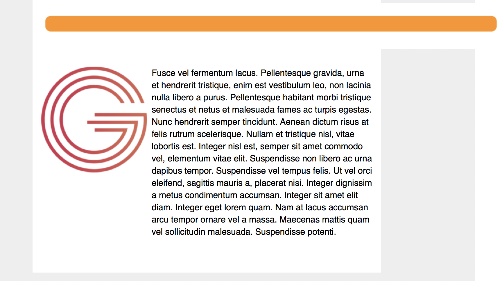
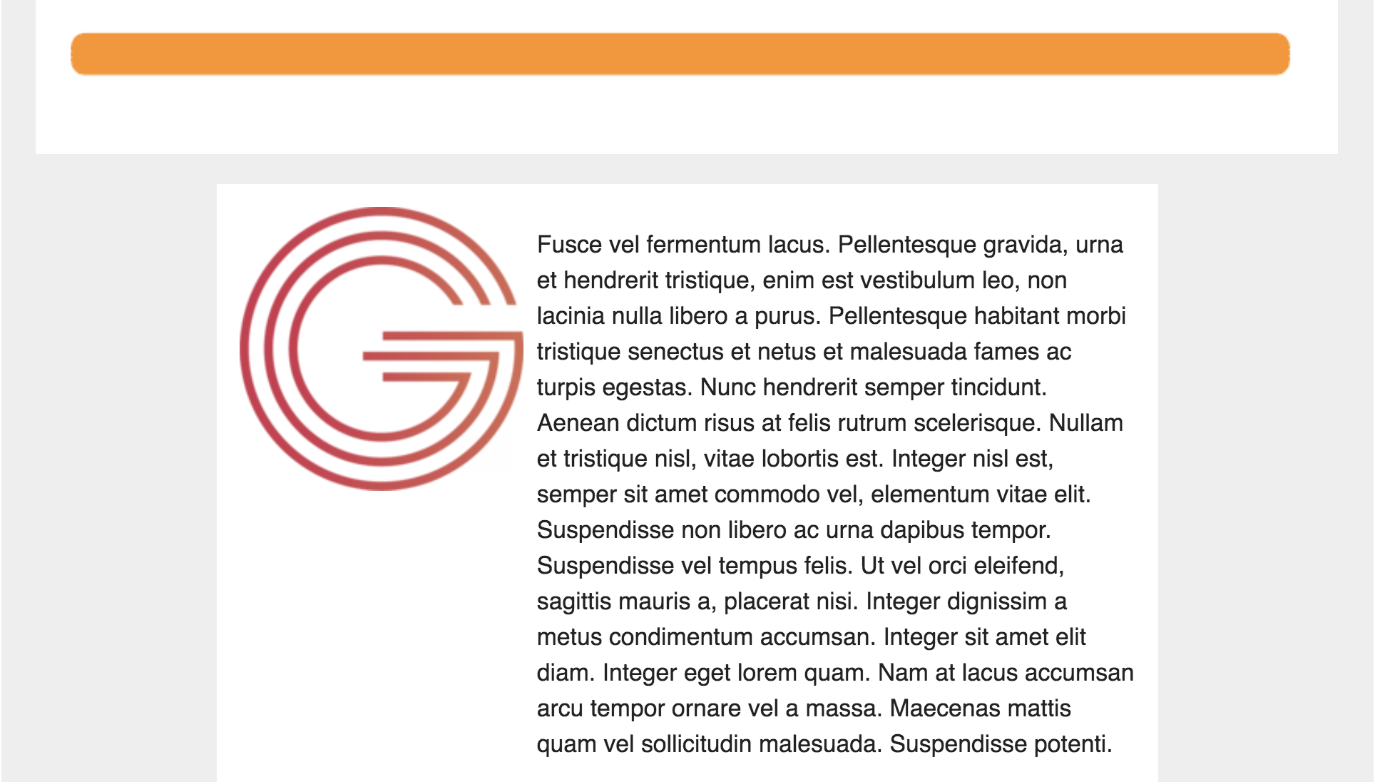
The default section divider for flexible templates, a thin horizontal line, will automatically scale to fit the size of the screen on which your bulletin is viewed. If you choose to upload your own image for section dividers in the Themes tab, the same considerations for other images should be taken: ensure that the image is no wider than 570px (or less, if you have added extra padding to the sides). Otherwise, the divider could overflow the bulletin's container, as illustrated in the screenshots below:
Outlook
Gmail
Footer
Much like your content and the general design of your bulletins, keep your footer simple. Use a single column design, with centered content that does not exceed the width of the bulletin content area, and include only the information you need: this will likely be your agency's contact information, unsubscribe link(s), and any legal disclaimers necessary for your agency's email communications. Because the content will be the main focus of your bulletin, don't let the design of your footer get in the way of the rest of your bulletin.


