Creating accessible content allows your communication to reach as broad of an audience as possible. For important government communication, it is especially vital that your messages are available to all your subscribers.
For online content such as email, the primary standards by which accessibility is measured are the Web Content Accessibility Standards, or WCAG. These standards require that any and all online content be perceivable, operable, understandable, and robust. Various government regulations such as Section 508 in the United States, incorporate WCAG standards. In many cases, creating online content which conforms to these standards is the best strategy to meet or exceed the accessibility requirements of Section 508, the Americans with Disabilities Act (ADA), or other international regulations.
It is important to note that it is the responsibility of each government agency to ensure that their content and resources are accessible. govDelivery provides administrators with the tools to create accessible content for their subscribers that conforms to standards set by WCAG 2.1 guidelines and section 508 (For more information, review the govDelivery Statement of Accessibility). While we recommend familiarizing yourself with the full set of WCAG standards, there are plenty of small steps you can take to make your content more accessible, right in the Advanced Bulletin editor.
Bulletin Content and Styling
When crafting your communications, one of the most important things you can do is to write clearly and concisely. This is especially important for email, which is often read quickly, or skimmed. Short sentences, written at or below an eighth grade reading level are generally readable by most people. You can take any text and run it through a readability check such as https://app.readable.com/text/ to check its reading level.
How your content appears to users and machines is another large portion of accessible content. Some of the major considerations are:
Color contrast
Text should always be perceivable on its background. The contrast ratio needs to be 4.5:1 for normal text, and then 3.0:1 or greater for large text, which is about 19px. Black text on a white background has a ratio of 21:1. You can check the contrast between any two colors here: https://webaim.org/resources/contrastchecker/
When using buttons, button text needs to have a contrast ratio of 4.5:1 against the button's background color. Additionally, the button background color needs to have a contrast ratio of 3.0:1 against the background color it is on.
Heading hierarchy
Part of making your content clear and readable is creating a logical reading order, which is often achieved through headers. The govDelivery Advanced Bulletin Editor includes three heading sizes, which should be used in order: e.g. H3 should follow H2, which follows H1. Heading sizes should not be skipped.
Alt-text
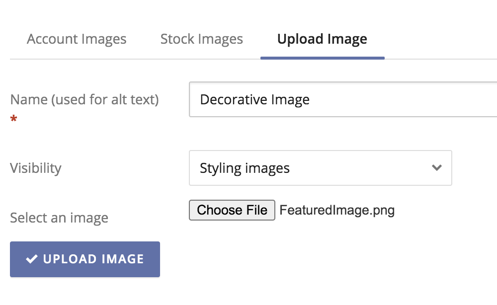
Any images uploaded to your account should always include alternative text describing the image. govDelivery makes it easy to add alt-text to images at the time of upload.
If an image is purely decorative, such as a section divider, you can select the "styling images" visibility setting when uploading. You must still provide an image name, but this will not be announced by screen readers when accessing the bulletin.

Aside from styling images, all other images should describe the image if there is information within it. Otherwise, if the image is linked, the alt text should also say where the link is going. Large graphs and charts, tables, etc., can be a challenge to provide alt text for, as they have so much information that can't all be captured in alt text. Adding a link to an external document that does capture the information is a way to provide the information.
Tables
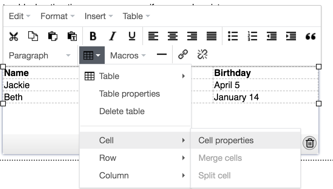
govDelivery's Advanced Bulletin Editor allows you to add a data table directly within a text block in your bulletin. In order for assistive devices to read the information in these tables, you must identify the row and column headers for the table. This can be done from the cell properties menu.

For more information on table accessibility, refer to the PDF document at the bottom of this page.
Tips
- Be aware of content that may be formatted as a hyperlink by email clients - this includes email addresses, dates, physical addresses, or phone numbers (if viewed on a mobile device). This link text is typically blue by default, which changes to purple once a link is clicked. For best results, avoid using either blue or purple as background colors.
- Be aware that some subscribers may be viewing your message in "dark mode" on their mobile email client, which sets a dark background color and light text color for all messages. For best results in dark mode, avoid using background images in your messages, and choose banner images wisely: either use a transparent png banner with a background color field and stroke around the image for better visibility, OR a full-width banner image, which will not change color in dark mode.
- If your email content is very long or contains lots of information in images (such as infographics), consider using a Landing Page to extend your content onto a separate webpage. Landing pages are not constrained by the formatting of email clients, so the text and image captions will appear as intended.
- Before sending a bulletin, review this checklist of simple accessibility topics:
Checklist
- Is my copy clear and concise? (Check with https://app.readable.com/text/)
- Does my text and background meet the minimum 4.5:1 contrast ratio? (Check with https://webaim.org/resources/contrastchecker/)
- Are text headings (H1, H2, etc.) arranged in a logical reading order?
- Am I conveying any information with only color? (e.g. a pie chart without labels)
- Do all of my images have appropriate alternative text?
- Would my bulletin benefit from a Landing Page, where I can share more information than a single email?
- Have I sent myself a test bulletin, and viewed the message in various email clients, browsers, and mobile devices? (For more tips, read our article on Best Practices for Responsive Bulletins.)


