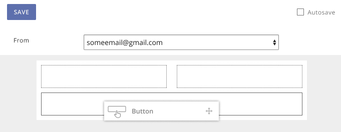
Create eye-catching Call to Action buttons in your Bulletins that drive engagement and clicks. Buttons are a great way for subscribers to easily interact with your bulletins, and can help direct them into finding more information on another webpage, or downloading additional content.
When creating an Advanced Bulletin or Advanced Bulletin
Flexible Template, drag a
Button content block into a Section of your bulletin. Click on the button to edit its text. There is no character limit, and the width and length of the button will automatically adjust to fit the text entered.

The bottom row of icons allows you to
lock the button, so that bulletin creators cannot change its text, lable the button as a
placeholder, so that the bulletin creator knows that they will need to edit the button's text, change the button's
link or
alignment, or delete the button content block entirely.

Button Links
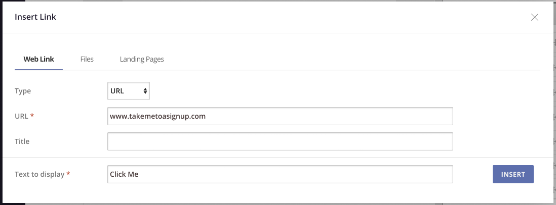
Set up the button's link to point to a
URL, a
file uploaded from your computer, or a
Landing Page already created in your account. For more details, read our article on
Using Links in a Bulletin. You can also edit the button's text from this window.

Button links will function the same as other links in your bulletin for the purposes of tracking: When viewing a Bulletin Detail Report, every link in the bulletin will be listed along with the total number of clicks and the number of unique clicks.
Button Themes
By default, buttons added to a Bulletin or template will appear as a blue rectangle with rounded corners and white text. Customize their appearance in the Themes tab when creating or editing a bulletin template. Existing custom themes can be added to bulletins, but themes themselves can only be created or edited from a bulletin template.

To change the appearance of your buttons, open
Column Defaults and expand the
Buttons section. From here, you can edit the button's background color, border size, border style, border color, border radius (for rounded corners), text color, font, font size, and text padding. This will affect all buttons throughout the entire bulletin, but you can edit individual buttons by opening a specific Row or Column in the Theme editor. There is no limit to the number of buttons you can include in a bulletin.
Read more about
Creating and Editing Themes for Advanced Bulletins.
Note: Every email client (such as Gmail, Outlook, Apple Mail, etc.) uses different rules for how they display certain content, and how they interpret certain code within emails. This means that an email which displays exactly as intended in one client, may look different in another client. To ensure your bulletins display as intended,
- ALWAYS send yourself a test bulletin, and open that bulletin on a mobile phone to see how it displays.
- Use a tool such as Litmus to preview your bulletin in multiple email clients at once, including mobile clients.
If you know that the majority of your subscribers use the same client, we recommend formatting and styling your bulletins with that in mind.


